We are Tennis
Bnp Paribas sponsors many Tennis Tournaments and has created in 2015 the ´We Are Tennis Fan Academy` as an extension of the main WAT Campaign, which aimed to create a meeting place for all Tennis entushiasts and offer exclusive deals for the most loyal Tennis fans.
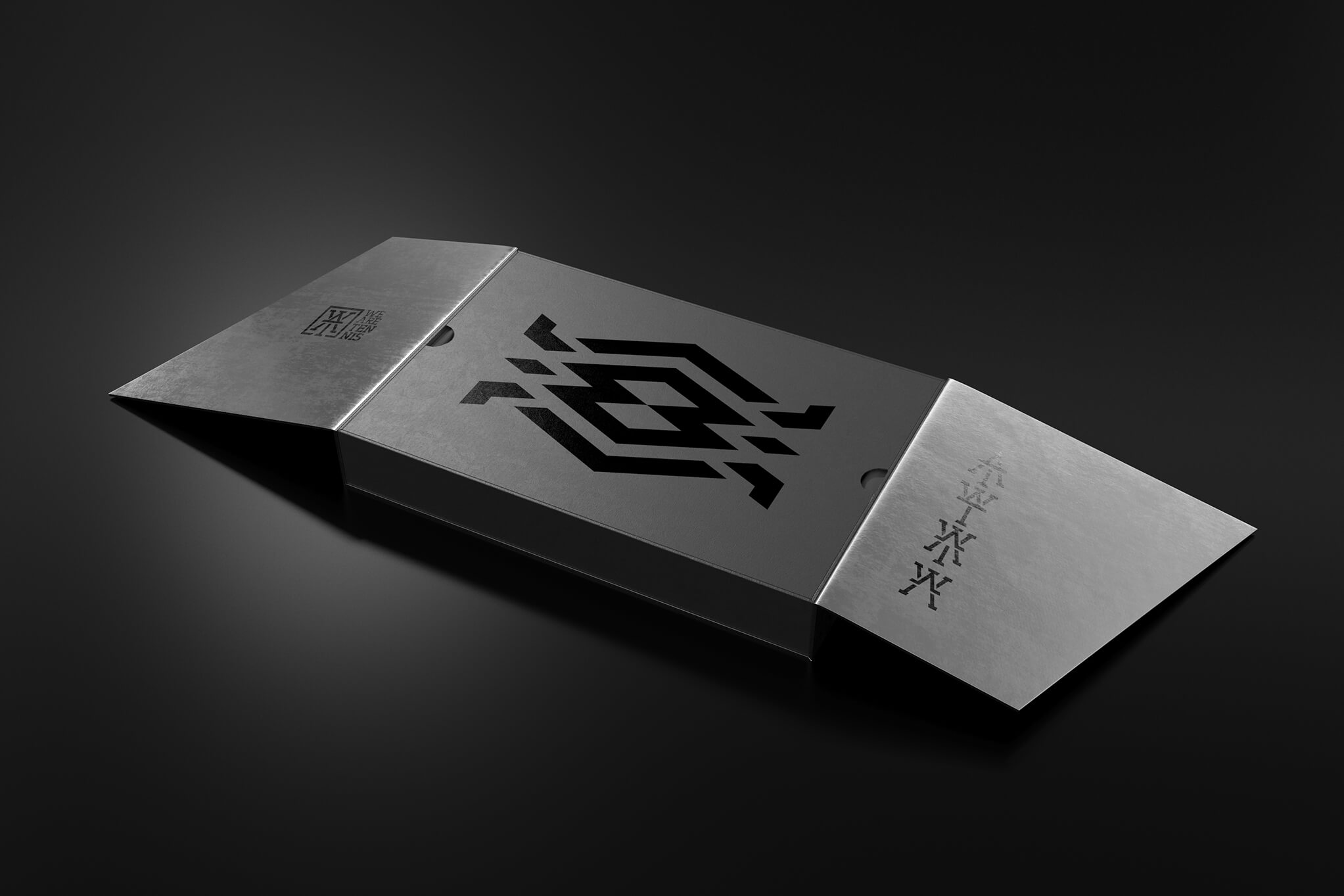
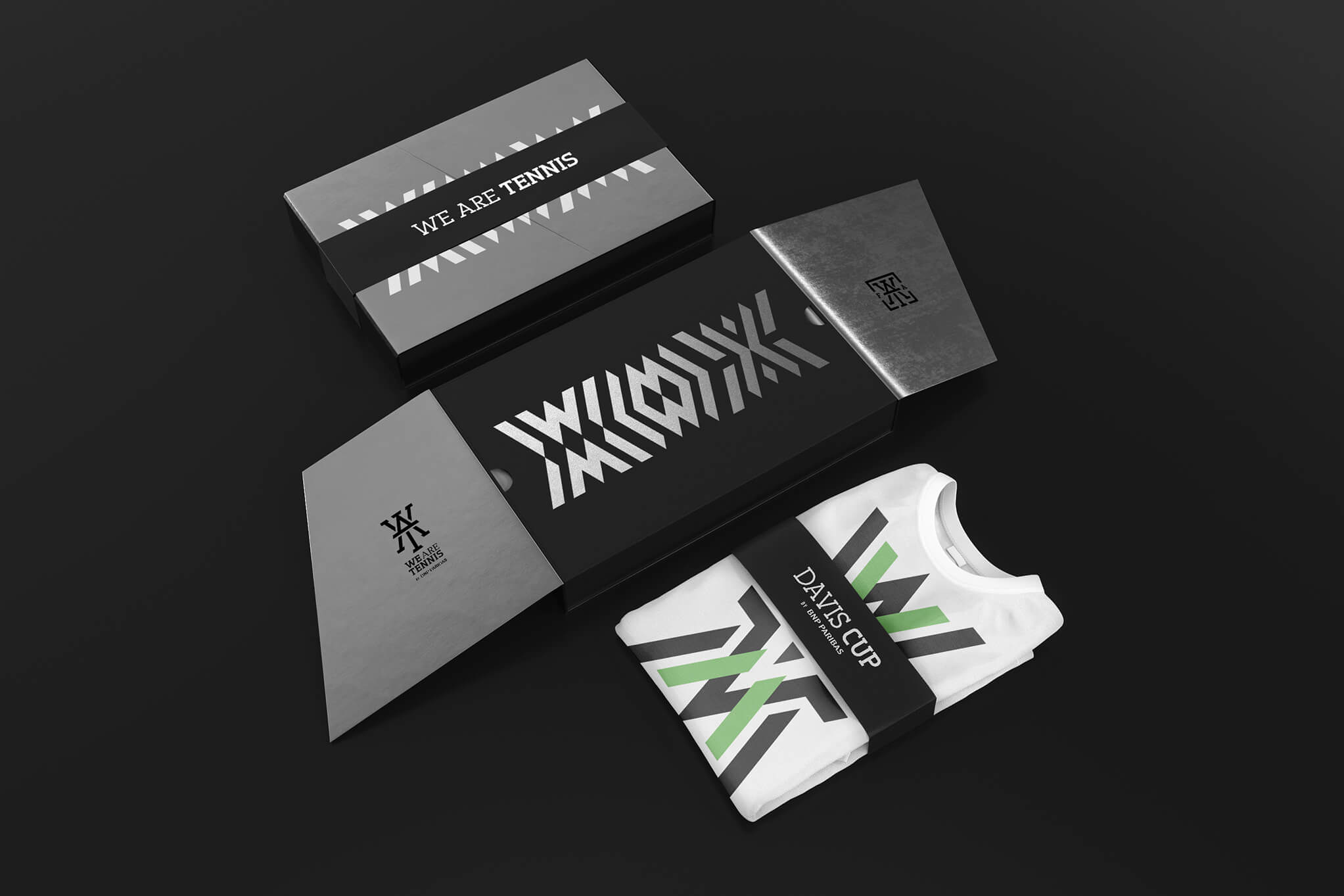
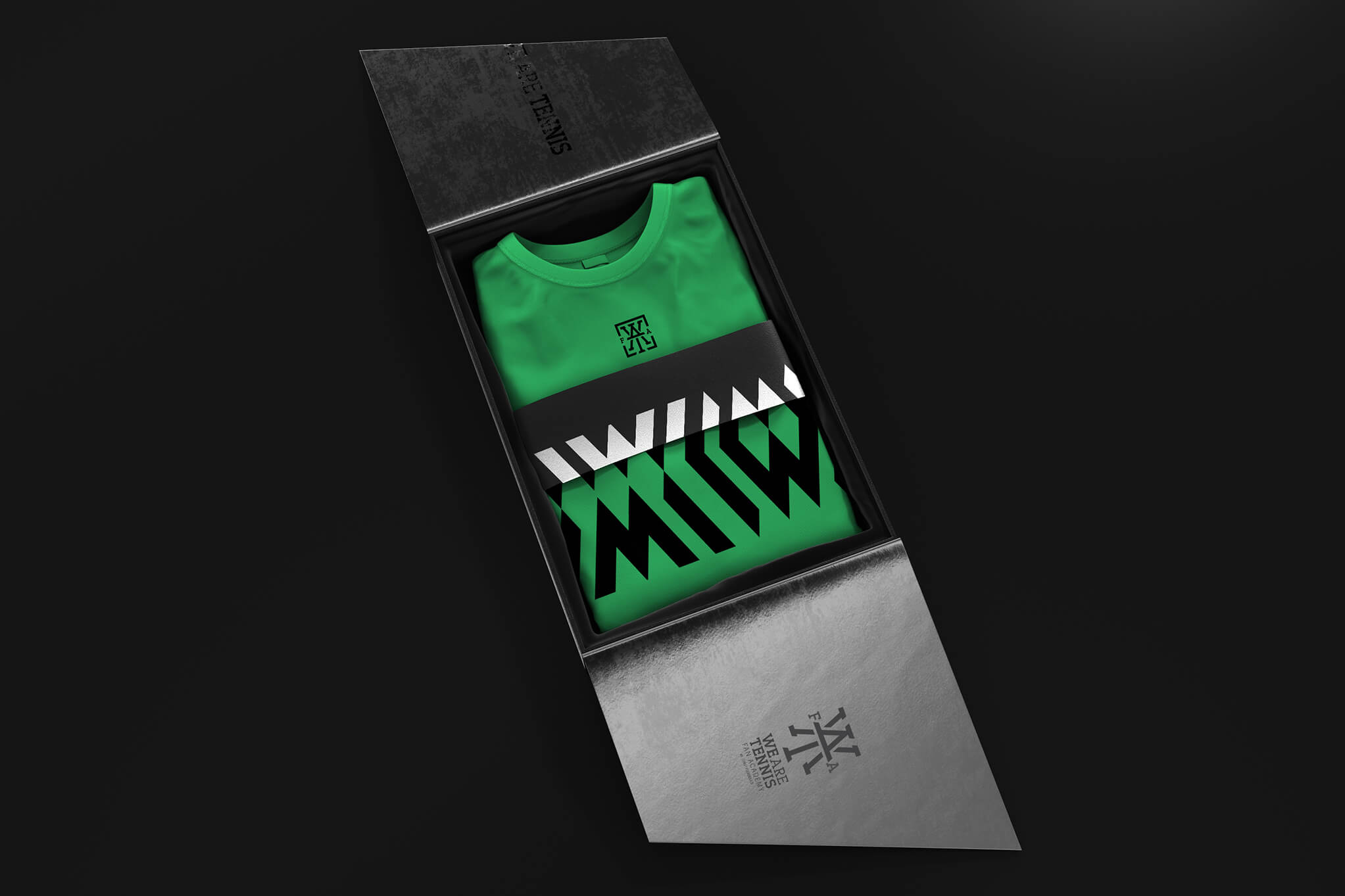
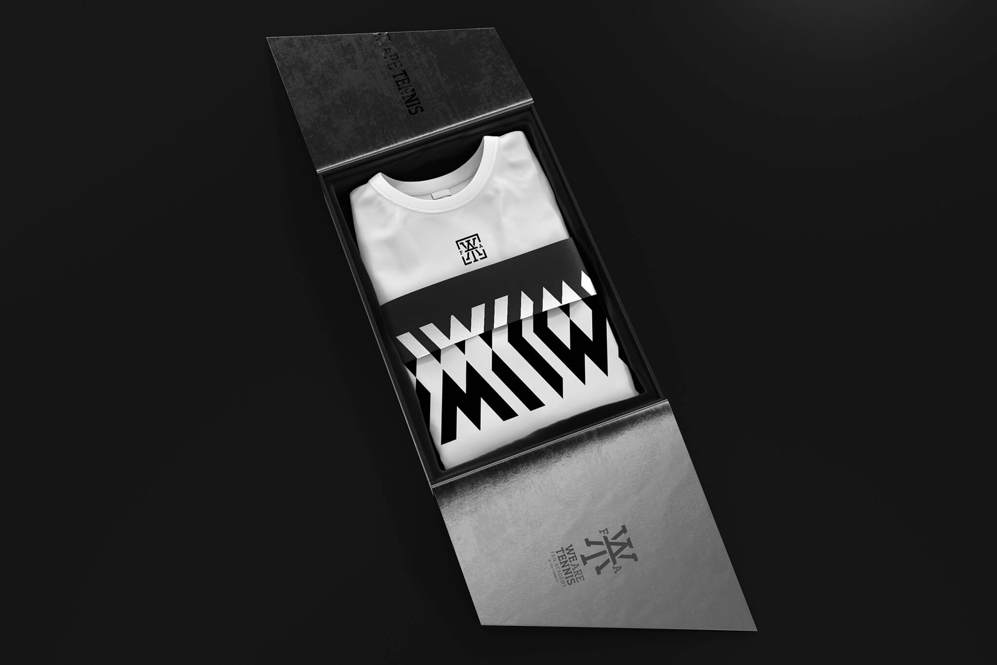
I was asked to create the whole identity and branding for the tournaments and all types of marketing collateral material, taking into consideration that they wanted to have a premium package and a specific VIP area designed for the more enthusiastic Tennis fans. I worked on this project through two stages, developing two different languages.
Agency
AKQA
Client
BNP Paribas
W.A.T.
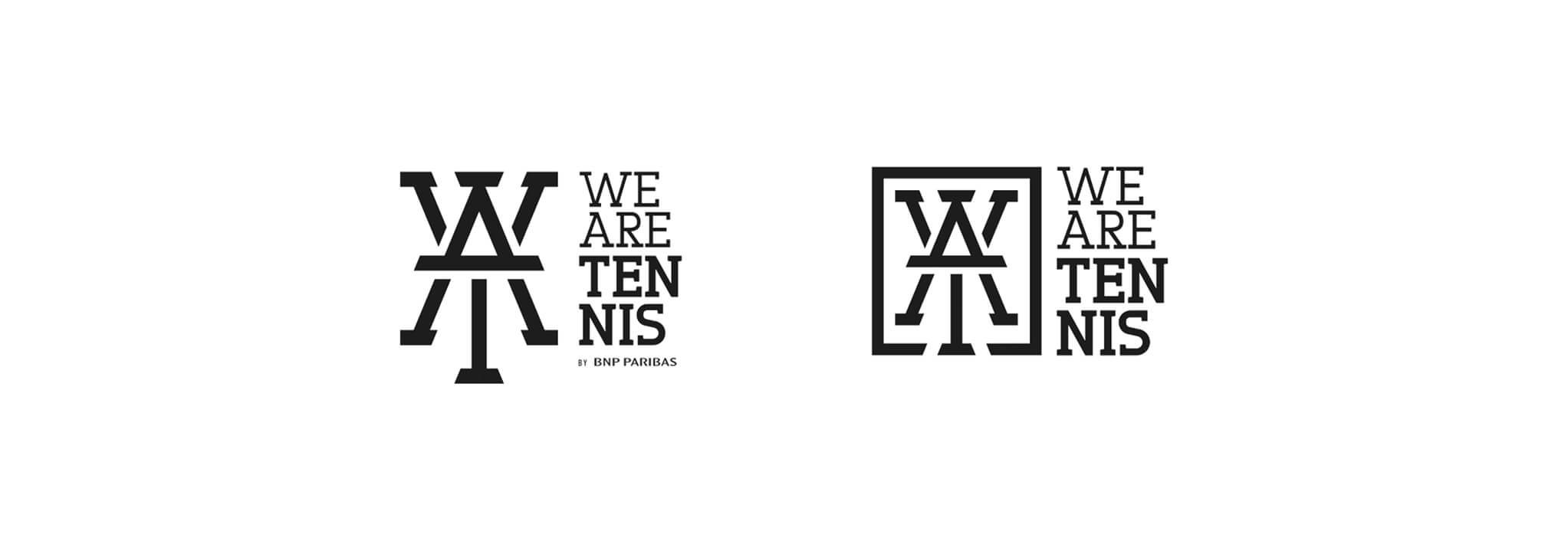
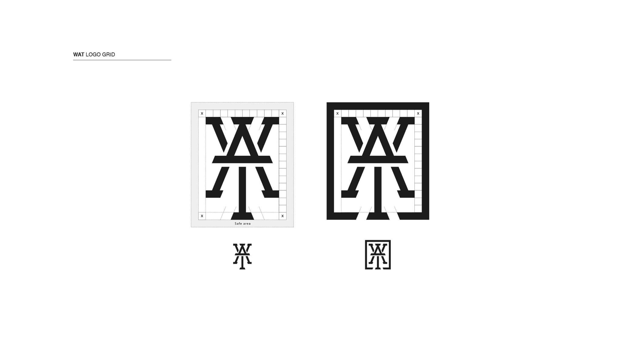
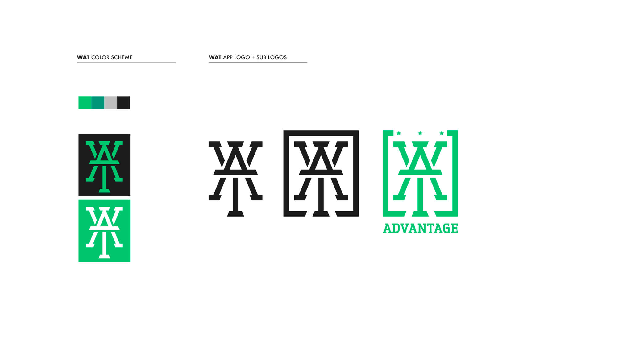
The structure of the logo
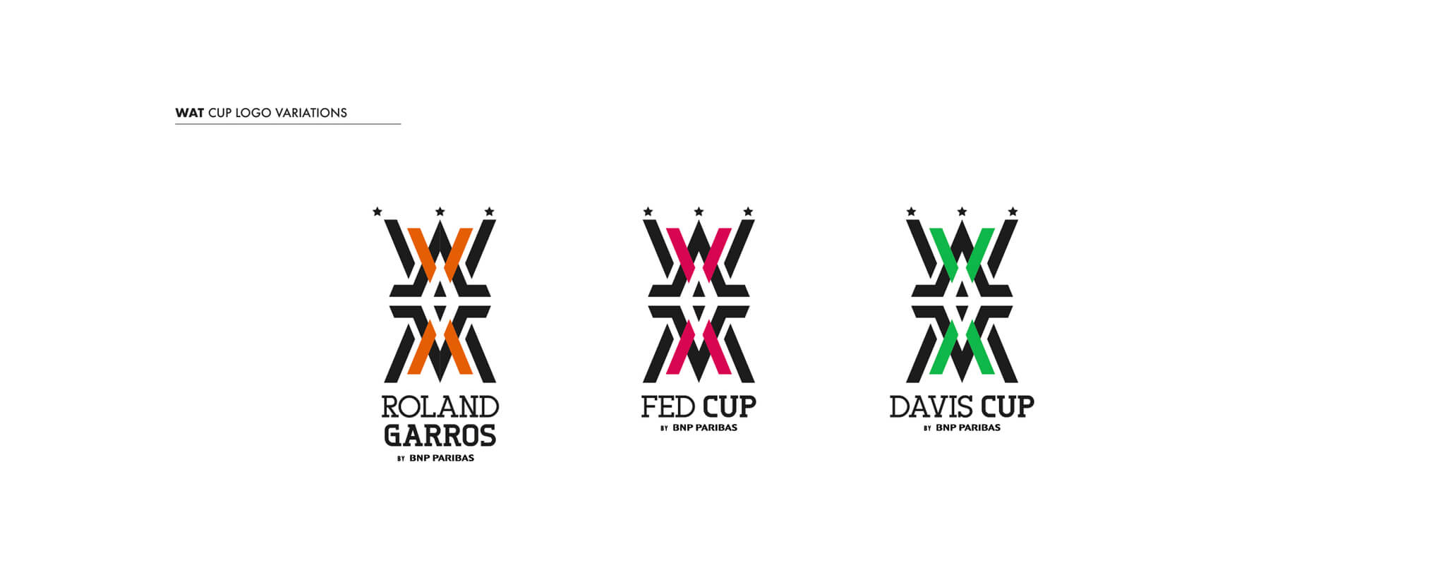
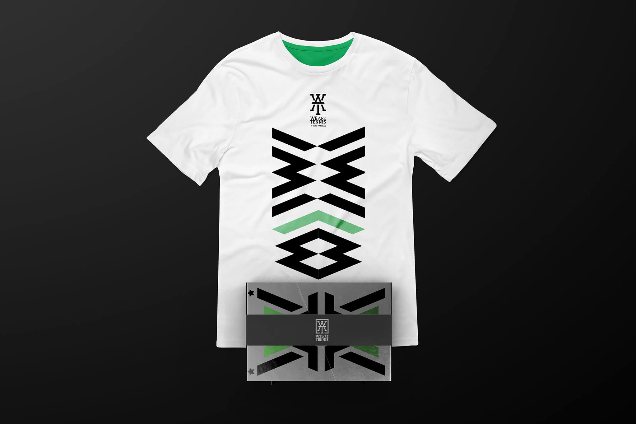
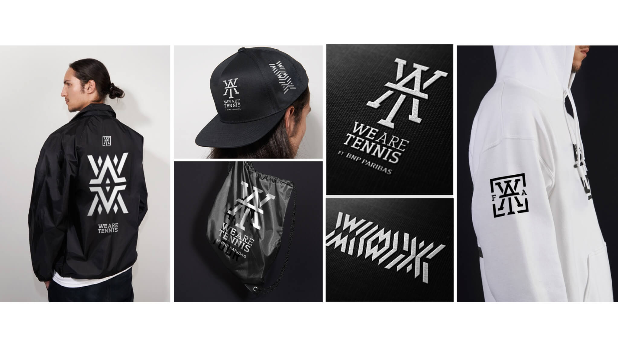
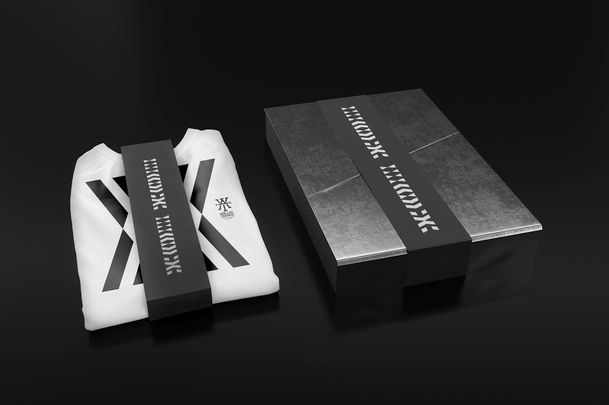
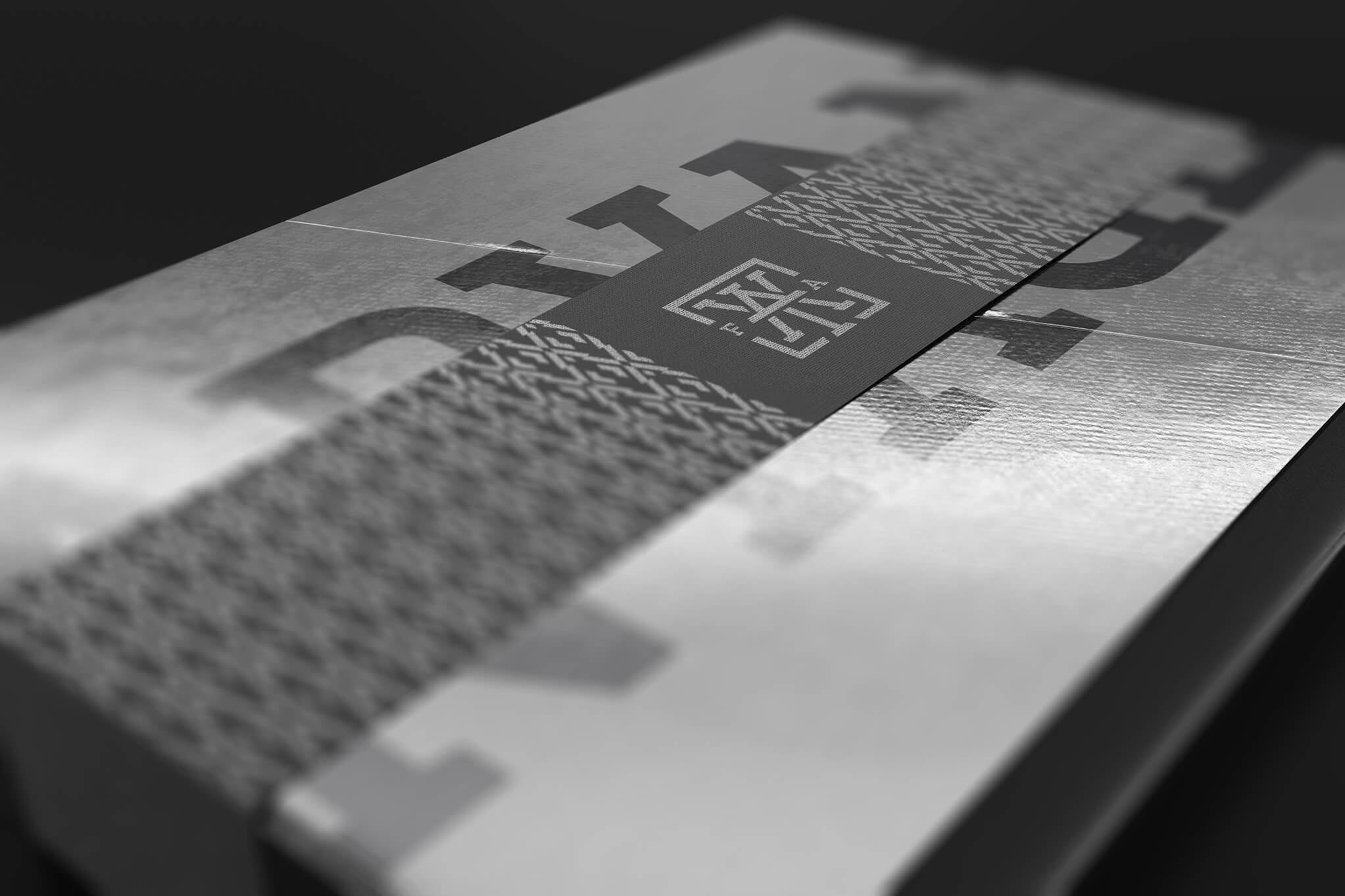
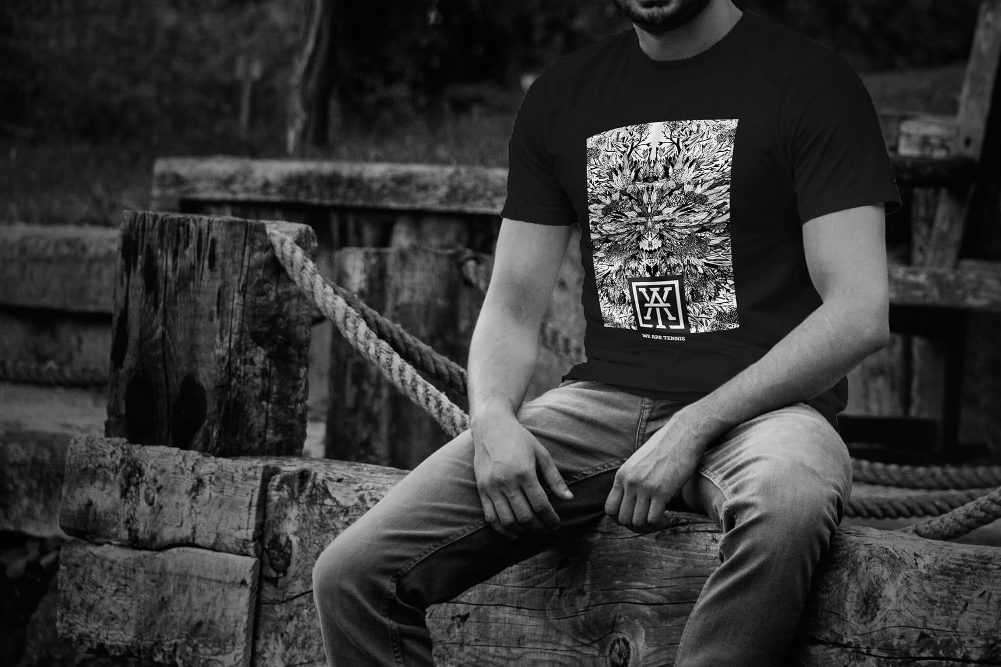
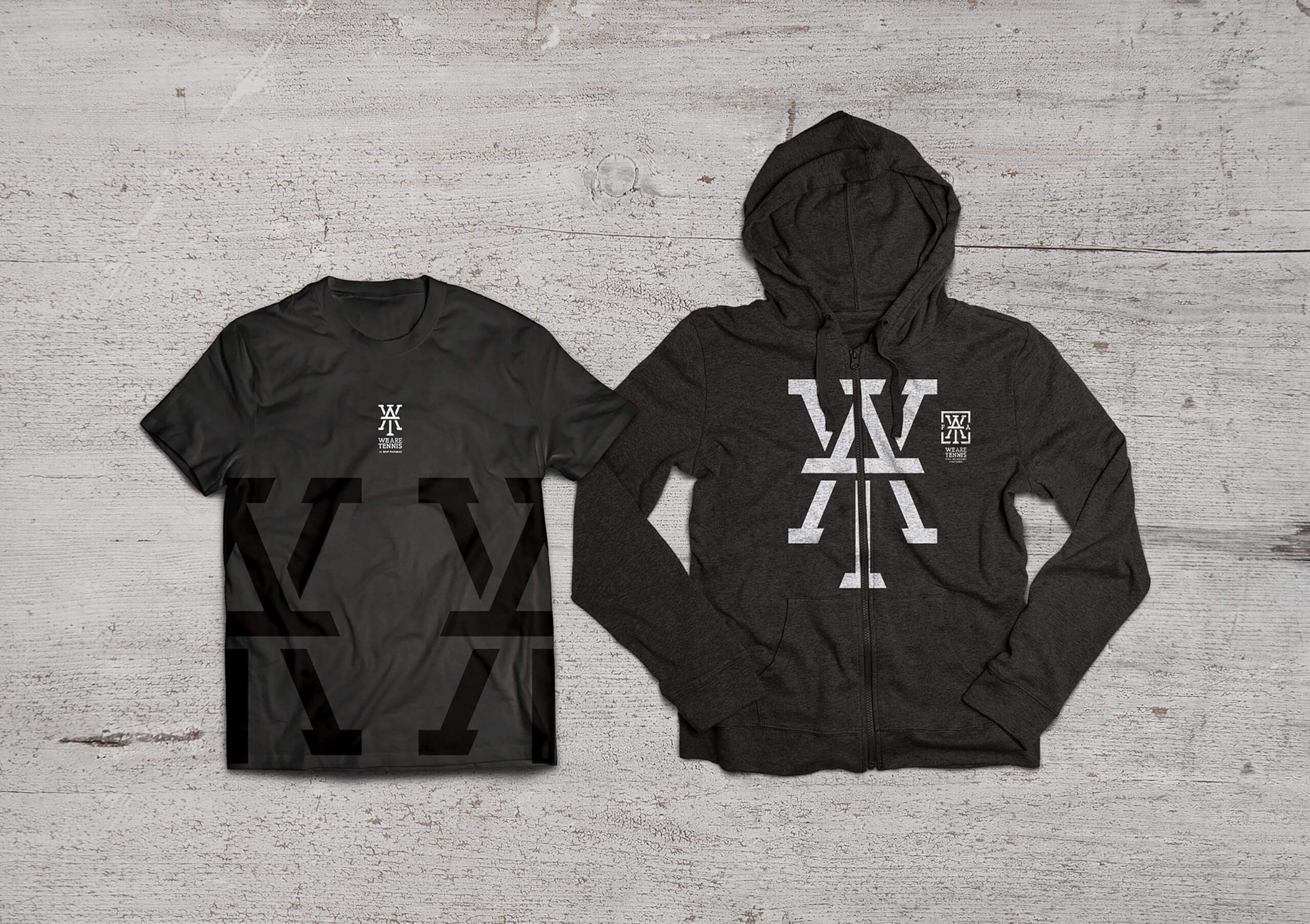
I created this logotype using the main letters of the Campaign motto, WAT stands for We Are Tennis. The way it is assembled is inspired by the tennis court structure and lines as well as its symmetry. Variations of the same logo include a frame that emphasizes the court lines using the W as a crown symbol for the premium membership that would include a premium package and VIP access to the tournaments.
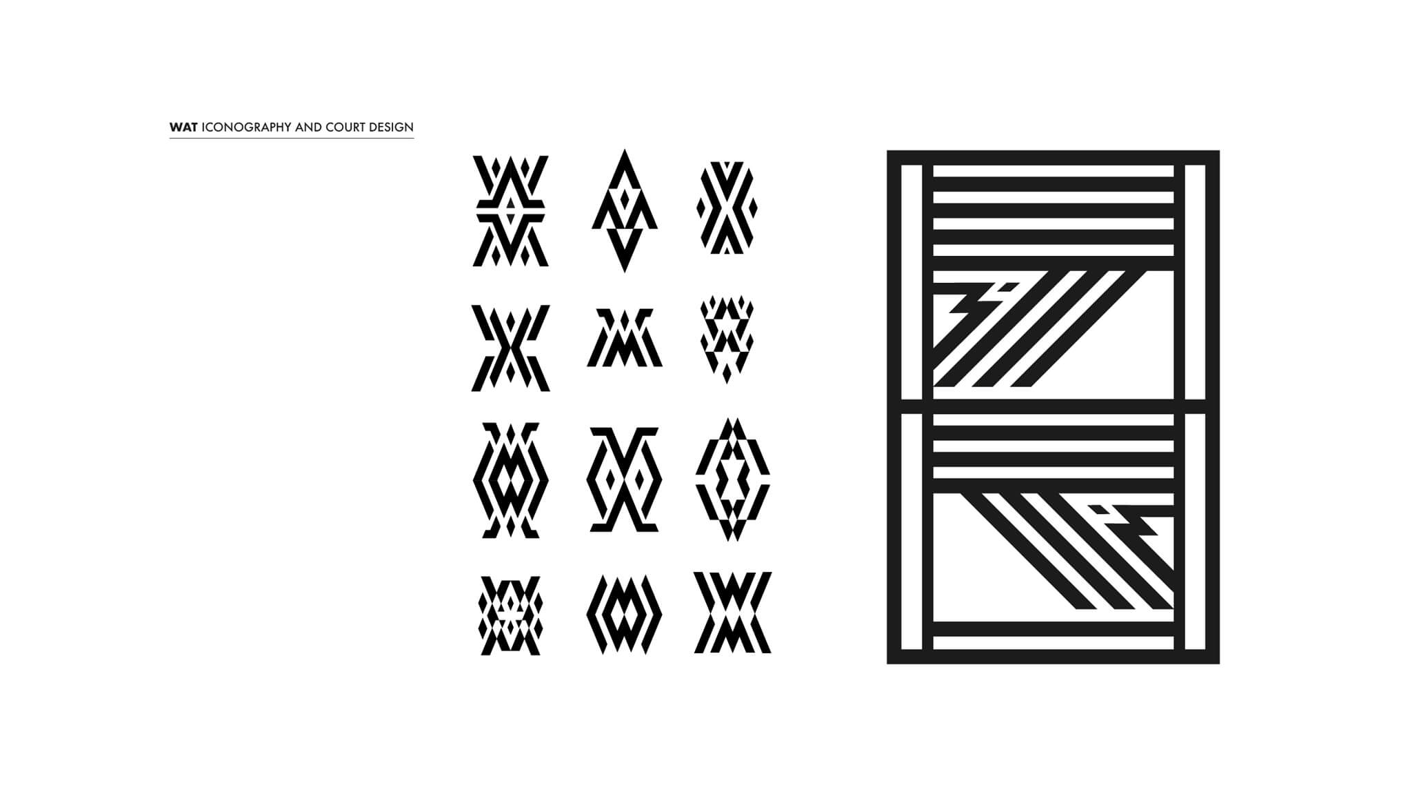
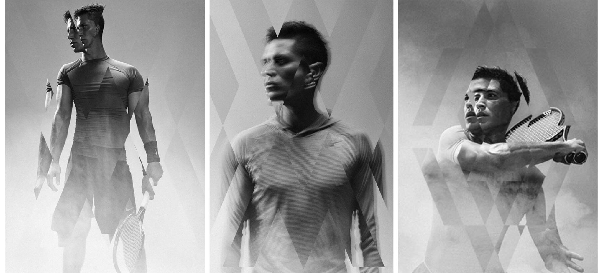
In order to create a supporting iconographical system for the whole branding I designed different icons combining different elements in a symetrical way and they were used on the app screens, and also helped to give the photography an edge, by slightly misplacing it within the grid of the icons, creating a sort of double exposure image.
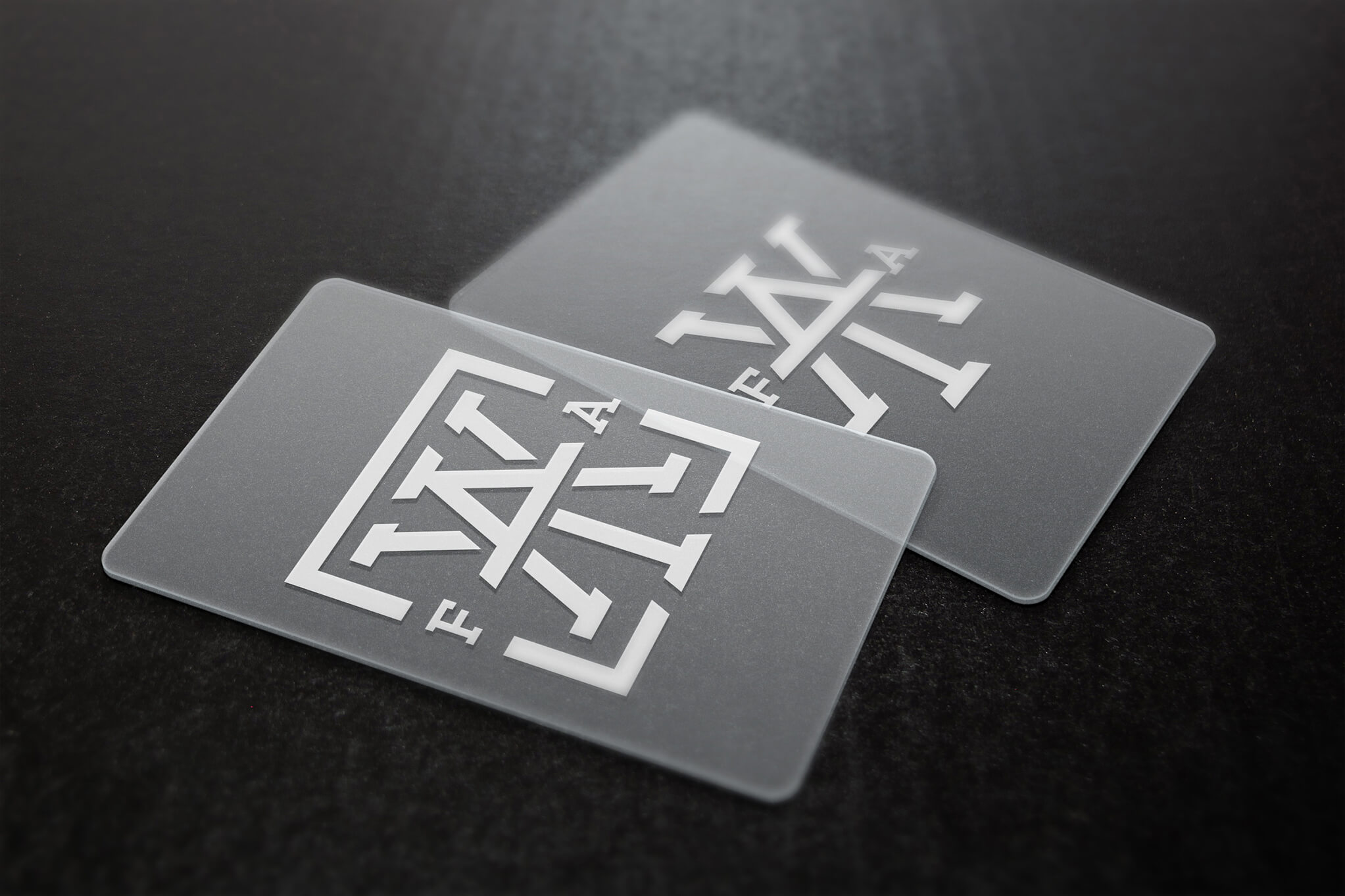
The key
The client wanted to create a premium card for the most important fans that would allow them to enter the tournaments through a VIP entrance where they would get to use the card. In line with this idea, I thought of creating an animation for the logo to be used across all digital platforms where it shows as if it is unlocking itself.
tour
naments

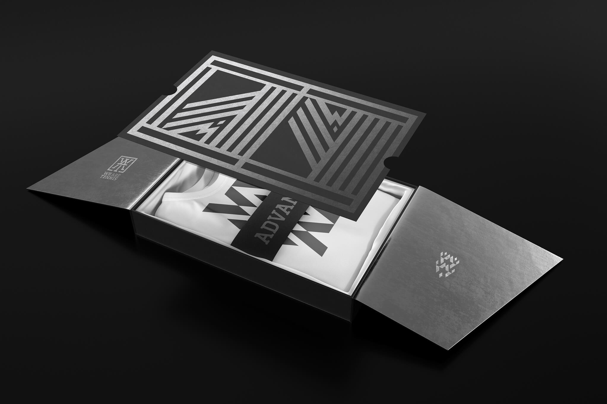
premium
Ana Pais
Let´s work Together!
ANA PAIS STUDIO . © ANANYM 2024