Akqa U
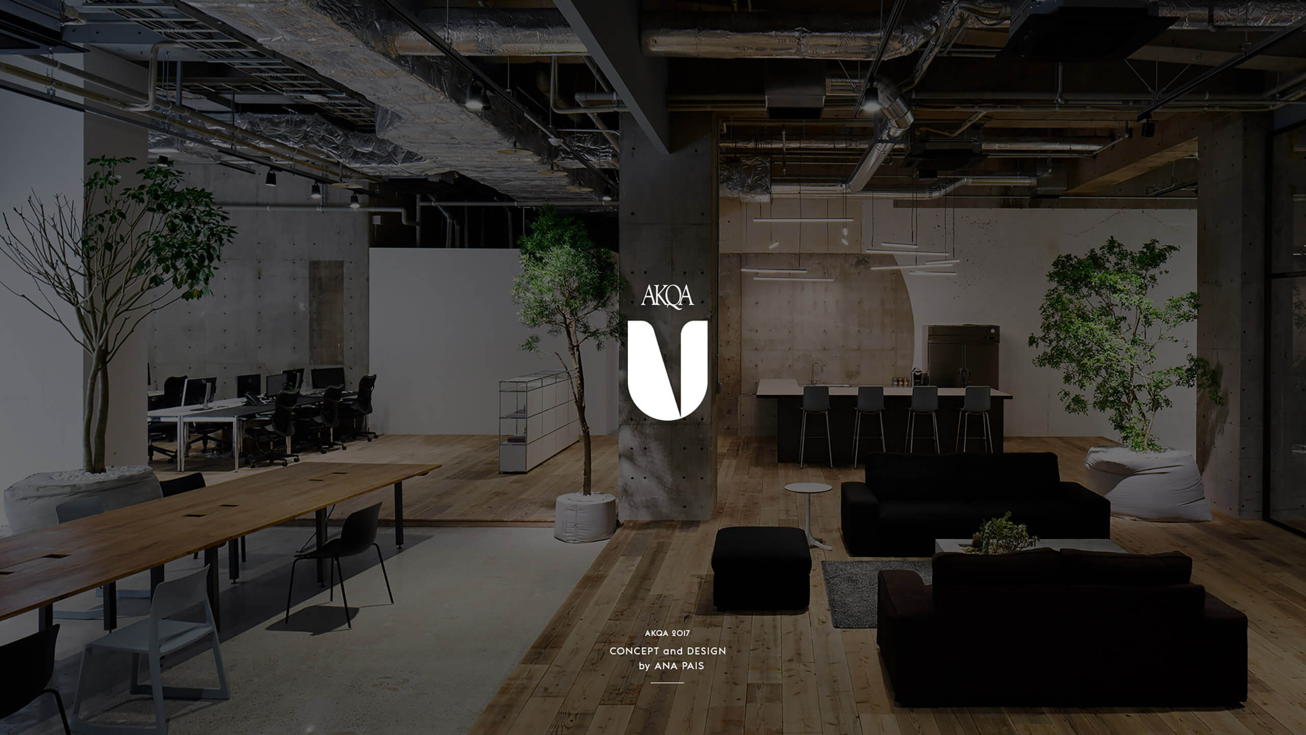
AKQA has asked me to create the Identity and Branding of its insightful and educational program initially named ´AKQA U` which later on changed to ´AKQA Insight`. I decided to create a modern, clean, sleek ´U` using a diagonal from the letter ´A` present in AKQA´s main logotype, and a circular shape that symbolizes a cycle, so that when the ´U` stands alone, you still have that subttle connection and a sense of familiarity even if subconsciously.
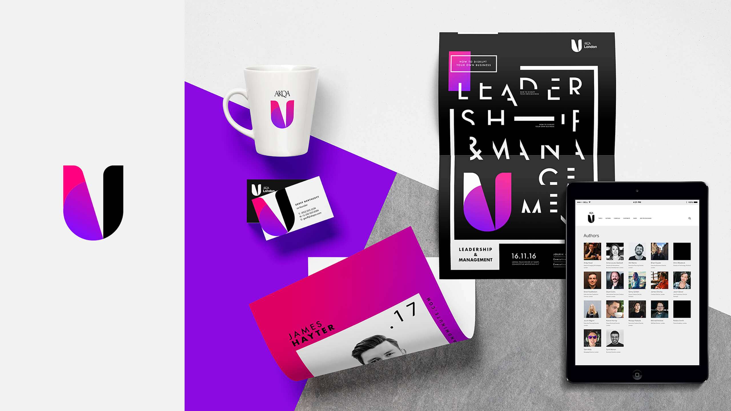
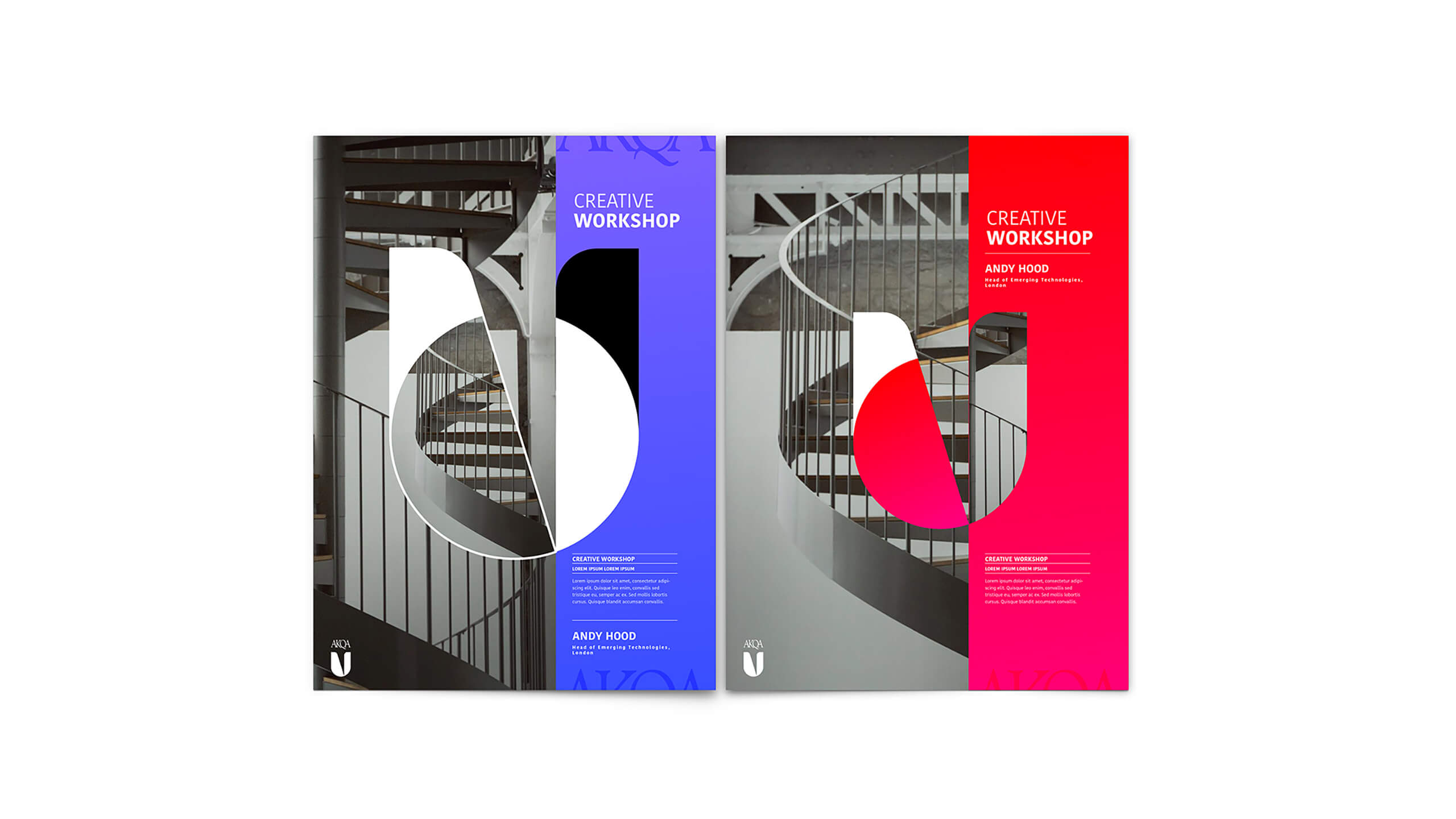
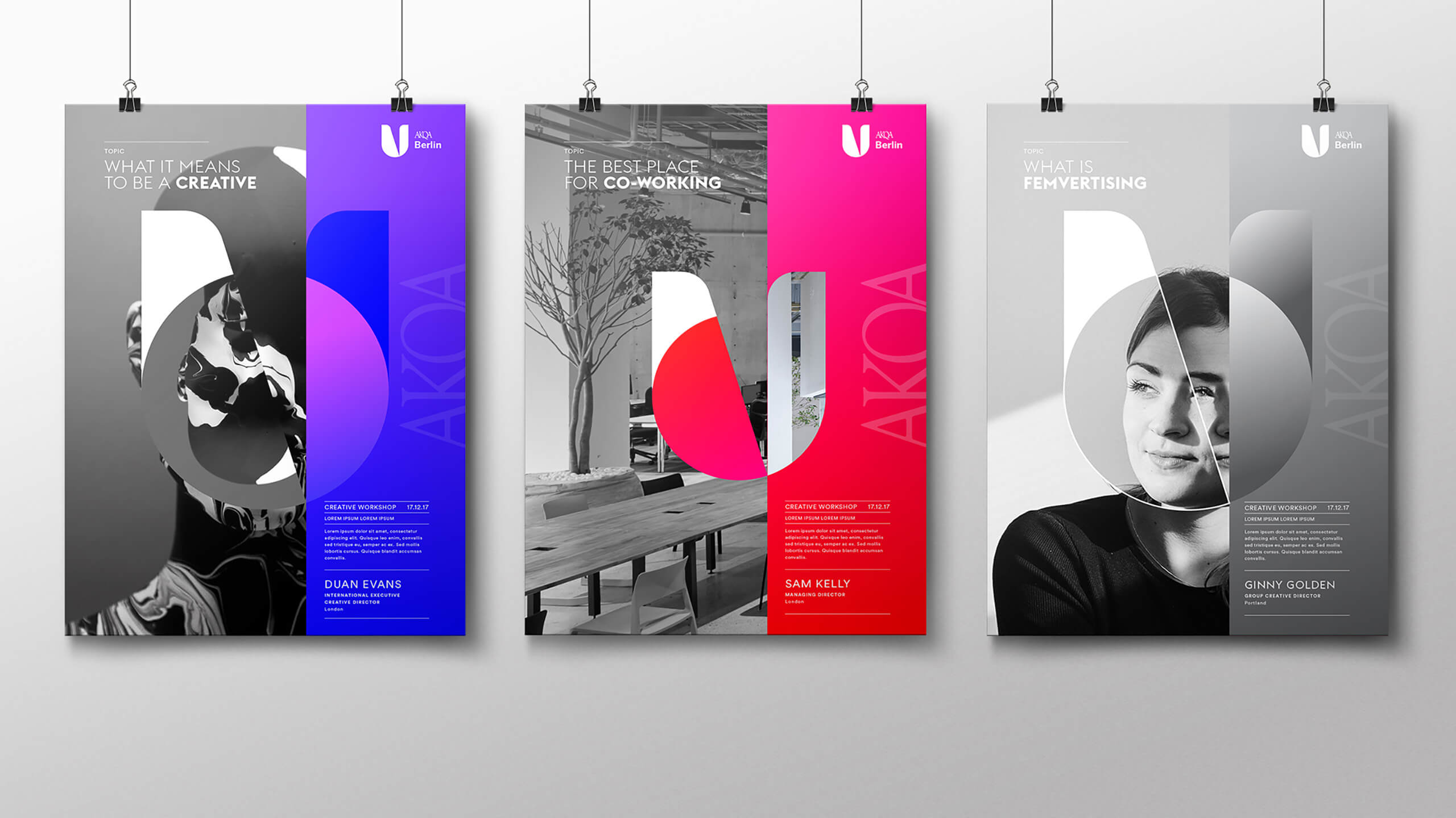
The logo changes its skin according to the subject in discussion, so the possibilities are infinite, and it can also be used as an ornament and grid for the many communication materials. The aim was to create an umbrella brand that could cover different sub brands connected to the many fields covered in this program.
Agency
AKQA
Client
AKQA
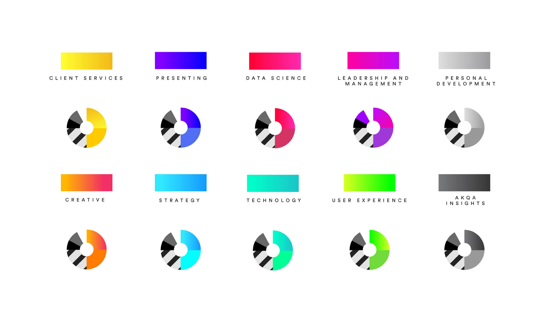
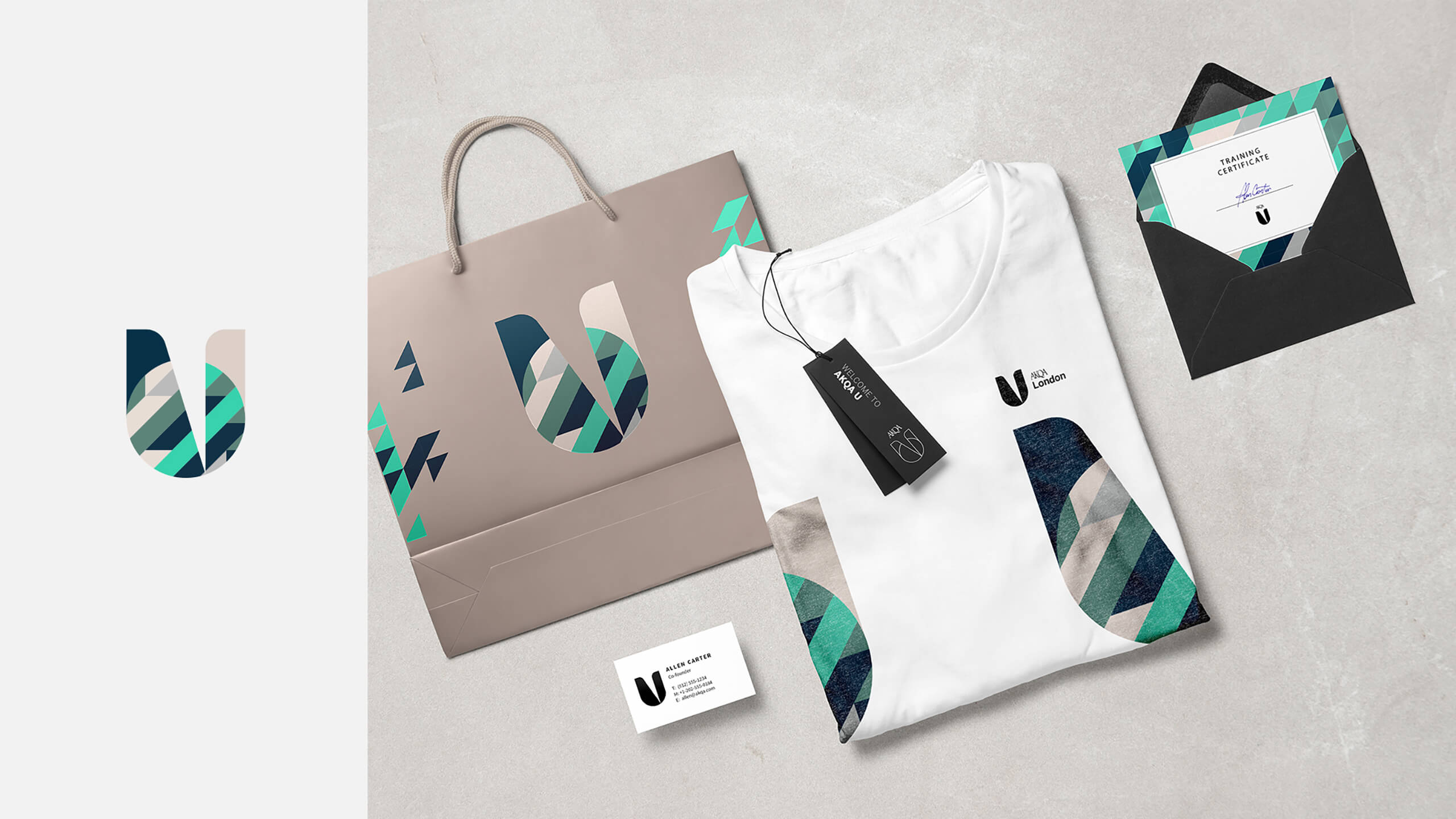
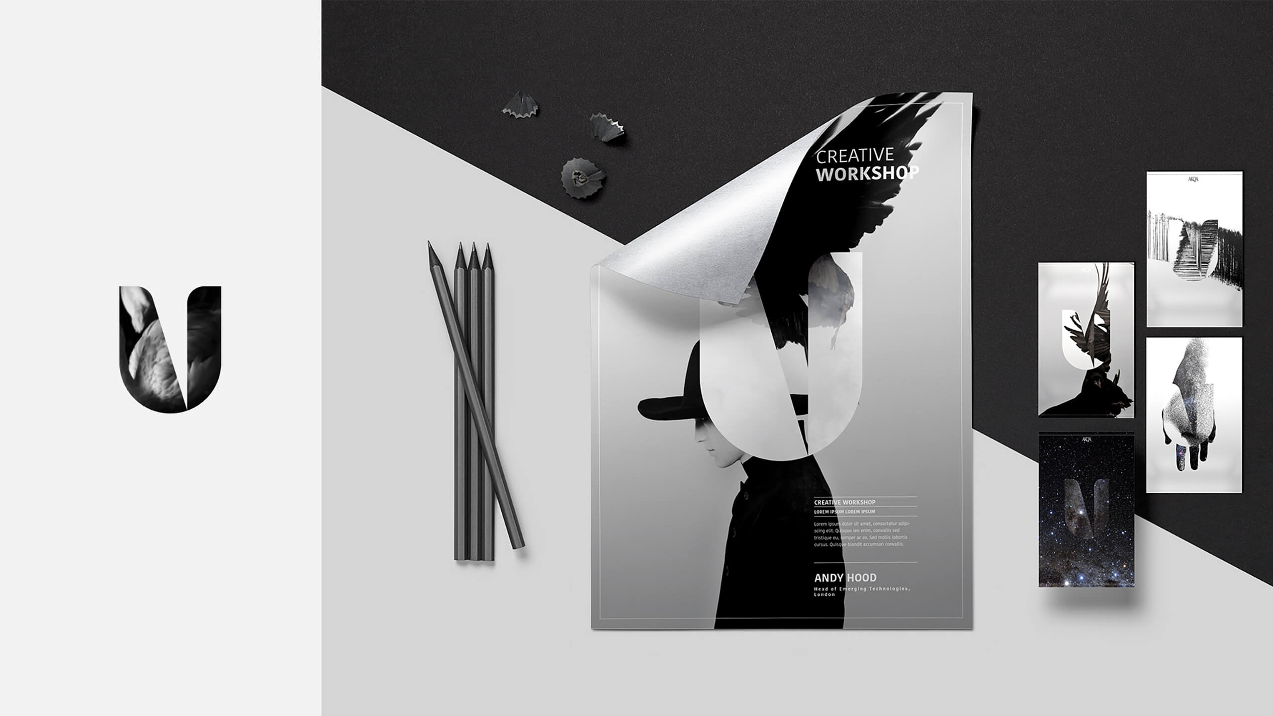
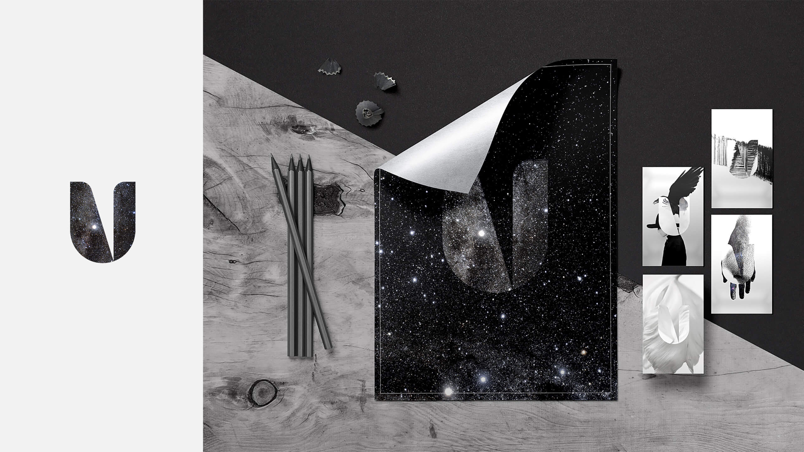
The anatomy of the logo
As previously stated, the logo was built with a particular structure, which allows us to divide the letter into smaller spaces that can contain different colours, patterns, and even become a window to showcase photography and footage in a larger scale.
Below we have a color palette for each educational field that when combined with patterns and all sort of graphics can elevate the logo to a place where it is more than just merely a logotype and more like a brand statement.
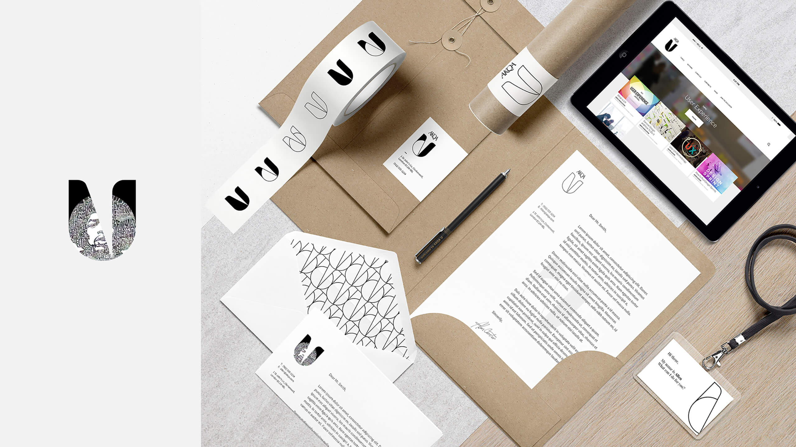
expression
stationery
Ana Pais
Let´s work Together!
ANA PAIS STUDIO . © ANANYM 2024